Showing posts with label STATIONARY. Show all posts

Sunday, July 2, 2017

Palomino Blackwing Volumes Vol 205 Review


(Sarah Read is an author, editor, yarn artist, and pen/paper/ink addict. You can find more about her at her website  and on  Twitter.)

It's funny how widely stationery opinions can range. I've heard several people (Brad included!) say that Volume 205 of the Palomino Blackwing Volumes is their least favorite so far, but for me it was the first one where I said, "Okay, fine, I will spend $25 on a box of pencils because I have to have those". And I have not been disappointed at all.


Like all the Blackwing Volumes, these are made from sustainable, responsibly-sourced California cedar. They smell delightful. This edition is designed to resemble the stone jade, both white and green--with six of each color in the box. The number 205 is the molecular weight of Jadeite, the most valuable variety of jade. The swirling colors remind me of the marbled papers inside old books, and I find the colors light and relaxing. I've found myself staring at the pencil when I should be writing with it. The brand is printed in gold, and there is a gold ferule with a black replaceable eraser.


This edition uses the firm lead core, the same as the one used in the 602. While it is definitely firm, it feels buttery smooth to write with, and I found it created a solid dark line, and shaded nicely. I scribbled for quite some time trying to see how long it would retain its point, and was very impressed. I'm certainly going to get my money's worth from this box of pencils, because they may outlast me. It will be a while before I have to sharpen this pencil.


The eraser worked okay--it took up most of the graphite, though it did leave a bit of shadow behind. If I were using these for sketching, I'd use a different eraser. But for writing, which I think the firm point is well-suited to, the eraser works well enough.


I confess, I am not a pencil expert--I have not tried all of the Blackwing editions, so I can't even say for sure if I have a favorite. So it's rather likely that those who don't care for this edition have a reason that is beyond my understanding. But if that's the case, ignorance is bliss, and I am very happy with these lovely pencils. If I didn't think that the ones I have were going to last me forever, I'd stock up on backup boxes.

I'd love to hear what your favorite Volumes edition has been, and why. This one has me wanting to dabble more in the graphite world.


Saturday, July 1, 2017

Typo A5 Buffalo Journal


The second notebook I received from Andrew that hadn’t been reviewed is the A5 Buffalo Journal from Typo.


Once I’d started to write in this journal, it became a quick favourite. The paper contained inside the PU leather book is extremely smooth and easy to write on. It’s not the thickest I’ve had, though. So perhaps stick to your ballpoint pen in this one. I did write with a fountain pen, just for the example, but when I flipped the page I saw that the ink did run through.

The size of this journal is not too small, but not too big. A5 is perfect for use at home, at work or even on your travels. There’s also a built-in inner pocket in the back of the journal which is super handy if you need to keep any loose notes or paper with you. This journal contains 176 lined pages, which is an excellent amount if you ask me. I prefer notebooks with around the 200 mark, just because I believe that the feel of a thick notebook is much better than one with only 50 pages.


As this journal is from around the 2012 year mark, Typo has updated their Buffalo journals. You can choose from an array of colours, including pink, turquoise, grey glitter and tan. Another perk is that it has elastic closure, lay-flat pages and a bookmark ribbon.


Being at only $14.95 from Typo’s online store, it’s a quality journal that will have you writing for a long time. Typo also has a lot of stores across Australia, so if you’re in need of a new journal, don’t hesitate to buy yourself this one.

Tuesday, June 27, 2017

Clairefontaine Age Bag Pencil Case – Natural Brown


Yesterday I picked up one of the best packages I have recieved in a while from the post office. It was my order (minus the Moleskine Messenger Bag – Review to come shortly) which I had placed at NoteMaker.
I will review everything I bought individually, and today’s review is the Clairefontaine “Age Bag” sheep leather round pencil case.

I picked this one up because I don’t have a nice pencil case, and I figure if I start getting some nice pens to keep in it, I might as well. The case is a smooth, fine grained leather with a soft velure-feeling interior. The zip is small, but sturdy and closes the whole way.


I decided to see how much my new case could hold. While well-made, it doesn’t really seem to be a “large” case, and I wouldn’t expect is to hold more than about 10 or 12 items. As you can see below, I set out to test this.


It performed surprisingly well. I managed to fit everything on the table (minus the super Sharpie) inside, without stressing the zip. That equates to a total 29 items including pens, pencils, highlighters and anything else I could find around the house.


If you were to keep it this full for a while, you would probably notice the leather stretching and (possibly) changing colour. Most cow leather items get darker over time. I can’t imagine Sheep’s leather to be much different.


In conclusion, I’m super happy with my choice. The case is able to hold enough to be ready for spontaneous games of Pictionary, it feels great, and it’s made well.

Leuchtturm1917 Master Notebook – Plain


So it seems that when it comes to notebooks, just like cars, computers, and McDonalds meal sizes, bigger is better. At least this is how I feel when I look at this amazing example I got from Notemaker. I was browsing their store, looking through the Leuchtturm pages when the name struck me. “Master”. And they aren’t joking, weighing in at 22.5cm x 31.5cm, and a hefty 233 pages, it is the opposite of “pocket”.


Here is the basic specifications: 233 pages, numbered with 4 empty index pages. 100GSM paper. Black hardcover, closure elastic, page marker, back pocket, lined and ruled guide-page, stickers for archiving, “Thanks for buying” card and a history booklet. It’s quite a bundle for a notebook.

While the size can be a problem for someone on the move, it’s perfect as a “desktop” book. Find a place it can live, such as a writing desk or workbench, and it is always there when you need it, with enough room for sketches, notes, plans, anything you can think of. You can see it here, open to the first page with my Rhodia A5 Webbie on top.


One of my favourite features is the numbered pages, and empty contents in the front. I had never heard of anything similar before, but it just makes perfect sense. I might even consider doing this manually with some of my other notebooks.
Somewhere during shipping there must have been a drop or a bash, and the bottom of the spine has taken it full force. The pages are slightly bent, and the cover material has torn. Luckily, it’s not too noticeable and there is no effect on usability.


The paper itself is said to be 100GSM and “Fountain Pen Friendly”. This confuses me a little, because it didn’t stand up too well to my writing test. I did most of the writing with my Pilot Varsity disposable fountain pen, and it seemed to bleed quite a bit. The writing experience itself was quite pleasant, however it wasn’t as smooth as Clairefontaine paper.


Another thing that kinda bugs me is the show-through. The writing test I did on the Rhodia webbie with 90gsm paper has very little show-through for everything except sharpies, however this paper seems to show through a lot more, and it is meant to be 100gsm. It might not be so noticable if writing in ballpoint or gel pens, but with fountain pens or sharpies, you will almost have to only write on one side of the page.


Problems aside, I still love the Master. The way it feels in your hands (plural, because it weighs a bunch!), the sheer vastness of the blank pages, and the extra included features make this my favourite notebook. I am really keen to put it through it’s paces and get planning my next project.

Altoids Tin Pencil Case


A quick search on the interwebs shows that there are dozens of potential uses for an empty Altoids tin, mostly for survival kits or as a case for small electronics projects; but not a pencil case. So, having sprayed mine with some leftover gold paint I assembled a few stationery items I just happened to have to hand...


Many just use the tins as they bought them, but I prefer to paint mine.
A couple of pencils, a Cult Pens pocket ballpoint, Muji sharpener and eraser, a couple of pins and paper clips and we're good to go.


The pictures of the Dumbbell Nebula and the Pleiades were pasted in to stop the contents from rattling too much.


DroodleBooks


I was contacted by DroodleBooks a few weeks ago and the time has finally come for them to launch their new professional notebook.

At DroodleBooks, they’ve crafted a professional notebook to help reduce stress and inspire creativity. Their mission is to integrate the creative advantages of colouring and doodling with the professional benefits of a regular notebook in order to fill the needs of working people, students and anyone in between.


I’ve always been a fan of colouring from when I was little, but with all of these adult colouring books available on the market today it’s hard to know what to choose. DroodleBook’s creative design can let you have two books in one, so that instead of carrying around a colouring book and a notebook, all you have to carry is a sleek and stylish DroodleBook.


DroodleBooks is great for art therapy to help reduce stress in their everyday. If you work full-time, are a busy student or even a parent, this notebook can help you find inner solace through self-expression. Droodlebooks also wants to bring out your inner creative. Even if you’ve only ever drawn stick figures, everyone deserves the right to feel and be creative, and with Droodlebooks that can be you.

Not only would this be a great gift for yourself, but also for that busy person in your life who you think just needs to sit back and have some time out.

If you’d like to get some more information about DroodleBooks, or even back their new Kickstarter project that goes live tomorrow, please head on over to their website.


Bellroy’s Notebook Cover


Over at Bellroy, they’ve created something new that everyone can enjoy. On November 8th, Bellroy launched their notebook cover; a leather cover for your notebook, cards and a pen.


Bellroy’s notebook cover is for those who are looking for a better way to protect their notebook or sketch pad. The cover is made from premium vegetable-tanned leather and is ideal for creative professionals who need to jot down ideas quickly, or record thoughts and lists to free their minds from the clutter.

“We wanted to design a jacket that compliments the notebook it covers. With an invisible closure and storage that hides your cards, we were able to deliver that pure experience.” – Hadrien, M, Head Product Designer.

The notebook cover comes in five main colours: black, blue steel, caramel, eucalyptus and java. Being made out of pure leather means that colour variations are small, but for a product that is going to protect whatever is inside, it is very attractive and appealing.


Bellroy’s notebook cover comes with a magnet closure that keeps your notes secure, while having debossed detailing which holds your pen in place when clipped over the spine. There is also extra storage inside that can hold a couple of cards if you’re using it on-the-go.

The idea of the notebook cover is to keep your ideas protected in a cover that is worthy of its contents. Being a writer myself, this product is definitely something I would use without a doubt; especially considering it is made of leather and will last me a lifetime.

Notebook cover features:

▪ Fits a small (3.5 x 5.5 inch) notebook or 1-2 passports

▪ 205mm x 103mm

▪ Pre-loaded with a free Bellroy notebook

▪ Space for a pen

▪ 4-6 cards

▪ Magnetic closure

▪ Premium vegetable-tanned leather

▪ Covered by our 3 year warranty


If you’d like to know more about Bellroy and their products, or get your hands on one of their new notebook covers, please head on over to  their website.


Monday, June 26, 2017

Planner Review: Quo Vadis Sapa X


I have added a new planning tool to my arsenal this year - the pocket-sized Quo Vadis Sapa X planner. After using DIY planners for many years, I felt that it was time for a change. And - while I was planning to buy myself a new planner at the end of last year - I conveniently won this Sapa X from the Quo Vadis blog. This is the first planner I've reviewed for this blog.


To start with, the Sapa X is a "pocket-sized" planner. The refill measures 3½ by 5¼ inches; with the cover on, the planner as a whole measures approximately 3¾ by 5½ inches. Compared to a standard Field Notes notebook, the Sapa X is the same height but slightly wider. It's a small planner, but actually not as small as I was expecting it to be, and I was surprised by how roomy the pages felt.

My Sapa X came with the Quo Vadis Texas cover; it's a soft, flexible cover with a matte, "faux-suede" finish and a feel similar to that of Rhodia's Webnotebook. My colour is bamboo green, which is a bright, happy shade of green, and the exact colour that I would have chosen if I had bought this planner for myself. The Sapa X is also available with the Quo Vadis Club cover, and in various colours. Both covers are refillable.


Removed from the cover, the planner is simply bound in white cardstock, making it easy to recycle or to file away once the year is over, and allowing you to re-use the cover for next year's planner. Inside, the Sapa X is printed with grey and teal text - a colour scheme that I think is easy on the eyes and that looks particularly good with my green cover! The paper is relatively lightweight at 64g (compare that with 90g for the Rhodia Webnotebook or 85g for the Quo Vadis Habana). This means that you can see the ink and text showing through a bit from the previous page, but that doesn't bother me. Apart from that, the paper is very smooth and lovely to write on with all kinds of pens. Some of my inkiest pens (such as the 0.7 mm Pentel EnerGel and the Pilot Hi-tecpoint V5) did bleed through slightly, although you probably can't even tell in the photo below. Because of the show-through and the chance of bleed-through, I'd suggest sticking to finer-tipped pens with this planner.


The Quo Vadis Sapa X has a weekly planner layout. The squares for each day are unlined, which I like, as it offers maximum use of the small space. An hourly schedule (from 8 AM to 7 PM) is printed along the right and left sides of each day. I'm not sure how useful this schedule would be. I think that the space in this planner is probably too small to allow you to plan your day hour-by-hour (unless your handwriting is very tiny), but it should be fine if you only have occasional appointments.

The left-hand side of the weekly layout contains the days Monday to Wednesday, a small notes section, and a tiny monthly calendar that highlights the current week. The right-hand side contains the days Thursday to Sunday. The space for Sunday is unfortunately smaller than that of the other days, and lacks the hourly schedule. This could be an issue for some users, but I think that it will still be usable for me.


Apart from the weekly planning pages, the Sapa X also includes yearly calendars for 2016 and 2017 (at the front and back of the planner, respectively), the usual page for filling out your personal information, a short section for addresses (which I'll probably use as notes pages), and several world maps (which, because of the small size of this planner, are almost unreadable). It also includes two unlined notes pages at the beginning of each month. I like the idea of this feature, but in practice the placement of these pages can be awkward. Sometimes they fall on two facing pages (which I like), but at other times they are on opposite sides of the same sheet, breaking up the weekly spread (as the photo below shows).


Overall, I feel happy with my Quo Vadis Sapa X. While it does include some features that I don't need (address book), leave me puzzled (monthly notes pages), or just don't work with its small size (maps), the most important part of the planner - the weekly layout - does work for me, and the overall quality of the planner (paper, cover, etc.) is great. If you need to do more extensive daily planning, I would suggest a larger size (and luckily, Quo Vadis makes many different styles of planners, so chances are they make one that will suit you). But if your planning needs are simpler and you would prefer a smaller size, then I would certainly recommend the Sapa X.

Tools of the Trade: Newton Pens Eastman


As I mentioned in my last post, I recently attended the Arkansas Pen Show as a vendor for the first time to sell find new homes for some of my handbound books. It was a wonderful experience for a number of reasons, but not least that my friend and I had the best table-neighbors possible for vending a show. We were placed next to Shawn and Elizabeth Newton of Newton Pens. There was much interesting discussion about art, craftsmanship, writing and tools thereof, superheroes, Maniac Magee (which I promptly re-read and love more than ever), and lots of other random things. There was no way I was walking out of there without finally owning one of Shawn's custom, hand-turned fountain pens.


Choosing just the right pen was nearly impossible. I hemmed and hawed over his incredible selection, chewing my lip as I fought back another wave of frustrated indecision.

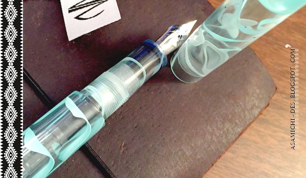
Okay, I'm totally lying. If I had allowed myself to actually do more than sneak a side-glance at his table, that is what would have happened, but I didn't let it. I couldn't let my eye wander over there, because (thanks to Shawn's amazing pictures on social media), I had already promised my love (and my money) to one of his pens in particular:


Shawn has made pens from this material before for other customers, and from the first time I saw it, I was sold. The color is gorgeous--soothing and mild, but with an icy vibrancy in the veining. When writing with it, I catch myself just stopping to look at it, enjoying the way the swirls bend and swoop in the walls of the pen, adding the illusion of mass suspended in weightlessness.


Basically, that's a lot of fluffy wine-tasting talk to say, "It's purty. Like, really." The light was not kind when I tried to take a few quick shots of the pen to add to this post, but there are some much better pictures on the Newton Pens site. (While you're there, go ahead and click the Newton Pens Scholarship tab. It is such a cool program!)


As soon as I entered the room to set up for the show, I was like, "HiShawngimmemypenpleasepleasehurrykthanks," because I didn't want anyone else making me have to fight them for it. When I finally had it in my clutches (along with a custom pen sleeve in the coolest geek-cred fabric made by Elizabeth Newton), I immediately had the strongest urge to go hide in a quiet room and write an entire novel. Unfortunately, since I had two days of selling books to do, I had to sit and stare at it until after the show when I would have time to put some miles on it.


It has some miles on it now.

Yes, it does.

First, I want to talk about the quality of the craftsmanship. This pen doesn't feel like any other pen in my collection. It wouldn't--it's completely unique, made by hand. That said, I dare you to find a flaw. It has been polished to incredible smoothness inside and out. It has been turned with meticulous care and consistency, for any variations of material thickness or machining technique would be fairly obvious in this, a clear pen. The form factor suits it so well: a simple, straight cylinder with flush cap and barrel. It allows the material to take center stage. The cap and barrel threads are tight, so the cap stays in place securely when the pen is closed. The tolerance between cap and barrel when closed is nearly seamless. It is not possible to post this pen given the shape, but the length is significant, similar to a Pelikan m1000, and should be sufficient for any size hands. Likewise, the pen is light enough to hold in quite dainty hands, even though it is of substantial size.


The filling mechanism is cartridge/converter, and it came included with a nice standard-international converter (and a fill of Waterman blue-black). It is also possible, with the addition of a smear of silicone grease on the threads, to use this pen as an eyedropper-filled pen. (Here's more information from Fountain Pen Revolution if you're not familiar with eyedropper-filled pens.) I bought a brand new bottle of Diamine Soft Mint (J. Herbin Diabolo Menthe would also work) just for this purpose.

I chose an extra-fine steel nib for the pen. Shawn now works with a partner who is creating custom gold nibs for his pens, but he also sources good-quality Jowo nibs, which can be found on several well-known manufacturers' pens. Personally, I'm a fan of the Jowo nibs, and I've rarely used a poor one. This nib is no exception, providing a relatively smooth writing experience with a moderate amount of pleasant feedback. (I consider some feedback, or paper-feel, very pleasant when writing. If you prefer a mirror-smooth writing experience, I might direct you to a broader nib. It's rare to find that quality in even the best fine and extra-fine nibs.)


As a crafts-woman myself, few things make me happier than supporting my fellow artists. This pen will remain a special part of my collection, not just because I love how it looks and how it writes (I do!), but because I know what it is to make something with my hands and the guts it takes to share that with others.

I write reviews like this and keep a "Tools of the Trade" portion of this blog specifically because I believe it is important to understand and find affection for the tools that make our endeavors not just possible in a minimal way, but truly enjoyable. I appreciate this pen like I appreciate other tools, and I love it like any number of other nice things I've been blessed to own. However, more than either of those things, I respect it and the hands that made it.

May all that care, attention, and passion infuse every piece I write with it.


Bic Exact-Tip Roller 0.6mm


I normally wouldn't bother reviewing a pen that has been discontinued, but the Bic Exact-Tip Roller is different. For one, it's got its own fan page on Facebook, created by users longing for Bic to make it available again (although the page hasn't been updated for two years). And also it is a really great pen. And since I recently came across a pair of these at a thrift store, I thought I'd quickly review them anyway.


The Bic Exact-Tip Roller is a chunky 0.6mm rollerball pen. Because of the size of the barrel, I think it would be great for anyone with larger hands, although I also find it very comfortable to use. It has a sturdy metal clip on the cap that you can actually clip onto things without worrying about breaking it off. The grip is soft but not squishy, and I like its textured pattern of dots. It also has a large and aesthetically pleasing window to show the ink supply, and, best of all, a needle-point tip! I love needle-point tips on pens.


At 0.6mm, the Exact-Tip Roller writes with a relatively fine line, and it is very smooth. The ink does not feather, even on cheap paper, but it does bleed through. Even on the 80gsm Rhodia paper there is a considerable amount of showthrough and some bleeding, although it writes so well otherwise that I can forgive some of that. It reminds me quite a bit of the Uni-ball Vision, but I think the Exact-Tip Roller is a much better pen (it does not feather, whereas the Vision feathers on just about everything, and it writes with a finer line). I love the black ink; it is very black and it really pops on the page. The red ink is rather dark and may not appeal to those who like bright reds, but I like it, and I think it is more suitable for everyday writing than a bright red.


According to this post at The Pen Addict, Bic stopped making these pens in 2005, which means that the pens I have must be at least eight years old. The fact that they write so well after all these years also impresses me. Overall, I think the Bic Exact-Tip Roller is a great pen. If they were still available, I wouldn't mind buying some more of them. It seems like a better pen that the other similar rollerballs that I have used, the design of the pen is good, and I love the ink colours. If you are lucky enough to come across one of these pens, it is definitely worth trying out.